Today, I have been learning the basic's of the Unreal 3 Editor...
It has been quite good, as in easy to learn "when you have a good tutorial video" that is... without it I wouldn't have a clue! There are so many tutorials for this but I got one when with my copy of Unreal Tournament 3 Special Edition with other bonus content. So I'm quite pleased with my first attempt. I feel that I could really get my teeth into it within a few more days considering that what I've learn today. I do feel more confident now too...
So.. here's today's workload using UE3 and the tutorial I followed. (Can't wait to get my work into this)
So.. here's today's workload using UE3 and the tutorial I followed. (Can't wait to get my work into this)
This is my first level with two rooms... I've been following the tutorial to get a understanding of how to use this Powerful piece of software... (that sounded like I was a spokesperson for Epic)... but it truly is.
From this simple layout, it wasn't hard to add the floor, wall and ceiling textures to create this room, as well as the lights.
Another angle... I was getting a little excited at this point...
A view, inside the room.
Another angle from inside the room.
Top View - I'm all to familiar with, using Maya - This package has the same views.
Wire-frame Mode - these are some of the Static Meshes I've used for the tutorial video. For some reason, some of the meshes they used were not in my version or anyone else's for that matter... I did a search for this issue and someone gave a good response to this and said... "Be Creative" in other words you don't have to use the exact same meshes as the tutorial... make your own ideas with the ones you have. So I used these guys which I this look pretty cool...
It's just a shame that I'm not making a 16th Century Japanese Environment! (Gutted) But I'm challenging myself and for what I feel I've achieve within the time I've had regarding the Viking Research, I feel that I've done well!
Fuller Version...
This is the section where I added and took away lighting... Lightning the scene is so important and to get it right for what I'll need it for will take a bit of time.
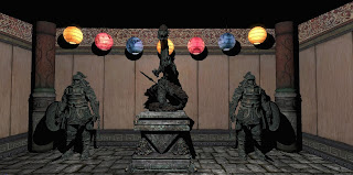
In this scene, I changed the lighting and got some nice shadows behind the statues...
I LOVE this Screen Grab -
The level of detail within this scene look amazing... this is down to the textures, bump maps, specular maps and lighting... I can't wait to test this level out.
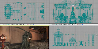
Here are the four view-ports which I mention before... you have:
Top - Front - Side and Perspective.
All in all, I have had a good go today and I'm very please with my results... This tutorial has helped me to learn the "how to's" I've learnt: How to create a room, add textures, lights, static meshes. I have also learnt how to navigate the view-ports, scale, move and to rotate the meshes. Grouping lights together for easy selection, change the light attributes and snapping to the Draw Grid which is very important.
I know I still have more to do but It's getting there. I'll will finish of the tutorials and each time I'll post up my progression. Once I'm more comfortable, I'll be investigating how to create a terrain and to edit it accordingly for my own models... or maybe if I create a big enough room, I could set up my environment within it... but we'll see...
End Of Part 1 -


No comments:
Post a Comment