Saturday, 27 February 2010
Friday, 26 February 2010
Onto the Next Level... Unreal 3 Editor Training... Part 1
Today, I have been learning the basic's of the Unreal 3 Editor...
It has been quite good, as in easy to learn "when you have a good tutorial video" that is... without it I wouldn't have a clue! There are so many tutorials for this but I got one when with my copy of Unreal Tournament 3 Special Edition with other bonus content. So I'm quite pleased with my first attempt. I feel that I could really get my teeth into it within a few more days considering that what I've learn today. I do feel more confident now too...
So.. here's today's workload using UE3 and the tutorial I followed. (Can't wait to get my work into this)
So.. here's today's workload using UE3 and the tutorial I followed. (Can't wait to get my work into this)
This is my first level with two rooms... I've been following the tutorial to get a understanding of how to use this Powerful piece of software... (that sounded like I was a spokesperson for Epic)... but it truly is.
From this simple layout, it wasn't hard to add the floor, wall and ceiling textures to create this room, as well as the lights.
Another angle... I was getting a little excited at this point...
A view, inside the room.
Another angle from inside the room.
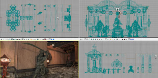
Top View - I'm all to familiar with, using Maya - This package has the same views.
Wire-frame Mode - these are some of the Static Meshes I've used for the tutorial video. For some reason, some of the meshes they used were not in my version or anyone else's for that matter... I did a search for this issue and someone gave a good response to this and said... "Be Creative" in other words you don't have to use the exact same meshes as the tutorial... make your own ideas with the ones you have. So I used these guys which I this look pretty cool...
It's just a shame that I'm not making a 16th Century Japanese Environment! (Gutted) But I'm challenging myself and for what I feel I've achieve within the time I've had regarding the Viking Research, I feel that I've done well!
Fuller Version...
This is the section where I added and took away lighting... Lightning the scene is so important and to get it right for what I'll need it for will take a bit of time.
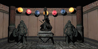
In this scene, I changed the lighting and got some nice shadows behind the statues...
I LOVE this Screen Grab -
The level of detail within this scene look amazing... this is down to the textures, bump maps, specular maps and lighting... I can't wait to test this level out.
Here are the four view-ports which I mention before... you have:
Top - Front - Side and Perspective.
All in all, I have had a good go today and I'm very please with my results... This tutorial has helped me to learn the "how to's" I've learnt: How to create a room, add textures, lights, static meshes. I have also learnt how to navigate the view-ports, scale, move and to rotate the meshes. Grouping lights together for easy selection, change the light attributes and snapping to the Draw Grid which is very important.
I know I still have more to do but It's getting there. I'll will finish of the tutorials and each time I'll post up my progression. Once I'm more comfortable, I'll be investigating how to create a terrain and to edit it accordingly for my own models... or maybe if I create a big enough room, I could set up my environment within it... but we'll see...
End Of Part 1 -
Monday, 22 February 2010
Blacksmiths Continuation...
I have started...
So I'll finish... Here are a few more Screen Grabs and Render of my progress with the Blacksmith Asset...
Blacksmith Asset - Screen Grab 1
Blacksmith Asset - Screen Grab 2
Blacksmith Asset - Screen Grab 3
This area was done with one texture map... still not sure whether to do this the same way as I have done the other bits by having one texture map with the different areas within it... this would make the textures look more sharper if I did... Currently, I have Unwrapped these together...
Back View -
Front View -
Also, I will be putting in some of my Viking Swords and Shields within this asset as a part of the scene with a few barrels... I still have to texture the hot stove area...
I'll defo will have all the bits I have left done by the end of the week and into one scene so I can lay them out as if they were within the Unreal Engine!
Nearly there now! Come' On! - The Next Chapter will be coming soon... Named: 'UnrealED'
Thursday, 18 February 2010
Continued Progress...
What a day...
I have finished ALL of my Viking Homes now and I'm making excellent progress with the other assets... I steamed rolled through my models so that I don't have any "unfinished" modeling to do as well as texturing. I'm not going to waffle on about my work but I'm quite pleased with the outcome... As I'm sat here, I've just realized something...
I need to add the "chimneys" to some of the finished models... but do you know what... it's fine... I'm may just leave them how they are because of time and effort. I have more pressing matters to complete so when I get all that I need to get done finished, then I'll add them (if I remember)..
Anyhow I've taken some Screen Grabs and Renders as usual to show what's been done.
Barrel 1 - Render 1
Barrel 1 - Render 2
Barrel 2 - Render 1
Barrel 2 - Render 2 -
These were textured with a 512x512 Map.
Deer Skull - Screen Grab 1 -
This was what I wanted to add to the houses to give it a more "real" feel. This was taken from one of my reference photo's from my visit to Jorvik.
Deer Skull - Screen Grab 2 -
I have placed all these on my houses...
It didn't take long to create which is always a good thing!
Viking Longboat - 1 Screen Grab 1 -
I really wanted to start again with the creation of the Longboats but I have managed to change it slightly to make it look better... Still need to Merge the Vertics down the center.
Onto the Houses...
Viking House 1 - Render 1
Viking House 1 - Render 2
Viking House 2 - Render 1
Viking House 2 - Render 2
Viking House 3 - Render 1 -
Can you see anything else??
Viking House 3 - Render 2 -
It was the shields in the above render... I think it looks pretty cool...
Viking House 4 - Render 1
Viking House 4 - Render 2
Viking House 5 - Render 1
Viking House 5 - Render 2
Viking House 6 - Render 1
Viking House 6 - Render 2
These are all my main Viking Homes which will be in my environment...
I have also made these...
Big Viking Home - Utility Grid Version - 1
Big Viking Home - Utility Grid Version - 2
Textured Big Viking Home -
Big Viking Home - Render 1
Big Viking Home - Render 2
And last but not least...
Blacksmith - Utility Grid Version 1
Blacksmith - Utility Grid Version 2
I'm done for today... my bed is calling me! See Ya!!
Thursday, 11 February 2010
Small but effective changes...
This Evening...
I've been going through some of my models and adding a few small changes thanks to a few friends of mine. I'm not gonna write a load this evening but I've posted the images of my models below... I still have a few more bit and bobs to do but it's getting pulled together! I'm now seeing more clearly with my models and the texturing part is getting better! I have a fantastic mentor!
Viking Hay Model 1 - Screen Grab 1
I have decided to add a nice touch (I feel) with a bow in the middle of the house... This gives it a little more realism because Viking homes were not perfect. It also adds a bit of weight to the structure which was an idea from my friend Martin...
Viking Hay Model 1 - Screen Grab 2
I also changed the roofing to a plane and made it look raised in different areas. I wasn't 100% happy with how the hay would look on the previous homes so today I had the idea to change it and made it happen... Now I feel much better about this and the way it looks, which can be quite hard to tell from the images.
Viking Hay Model 2 - Screen Grab 1
This model will be change (only the texture for the window) to make it look different from the other images... it already has a different Hay texture colour.
Viking Hay House - Screen Grab 3
Viking Hay House - Screen Grab 4
This is to show what it looks like from different angles.
Big Viking Home 1 - Screen Grab 1
Here is another model of one other Viking home models which will be in the scene.
Big Viking Home - Render 1
Big Viking Home - Render 2
Only more to come now... I've been working on the weapons again just to change the textures and the battle axe which didn't look to good for me... I'll post the changes up tomorrow along with the other finished models.
Subscribe to:
Comments (Atom)


